Page 1 of 2

Active MIDI inputs section can become too small

Posted: Sun May 24, 2020 1:46 pm
by Koshdukai
Already mentioned this previously:
Koshdukai wrote: Thu May 21, 2020 11:15 am One other extremely annoying issue I was hoping 2.0 would solve is the Active MIDI input tiny list where it only shows 2 ports at a time.
Problem is, when trying to scroll it with a mouse-wheel, it skips some of the ports, so I'm unable to access those easily (the wheel's 1 tick equals more than 2 lines of the list)

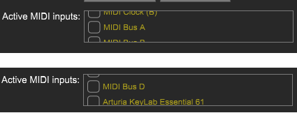
Here's an example, where I'm unable to access MIDI Bus C:
Active MIDI inputs list issue.png

A bigger (taller) window with more lines showing would be appreciated, more usable and surely overcome this issue as a side-effect.

Edit: Currently, the only workaround I have is to click on one of the lines and then use the keyboard arrow keys
But I just realized the issue has another level to it.

Not sure why, today, VM 2.0.15 started with no ASIO device selected and probably because of that, the Active MIDI input had a generous size, making it (finally) perfectly usable.
Active MIDI inputs list issues.png
Active MIDI inputs list issues.png (48.11 KiB) Viewed 6621 times
For a split second, my reaction was " :o YES!!! V.2.0.15 fixed this too!!! YAY!"
Then, when fixing the missing ASIO device, I realize that the issue is still there :(
So, it looks like, once the Active IO channels are listed (fortunately, minimum of 4 lines per list!) the Active MIDI inputs shrinks back to a 2 line list :?
Image

So this might not be affecting everyone in the same way, but it's still annoying and not easy to use, in these cases.

Re: Active MIDI inputs section can become too small

Posted: Sun May 24, 2020 1:59 pm
by martb
Don't know what's going on there but for me it looks like this:
midi_select.jpg
midi_select.jpg (22.21 KiB) Viewed 6615 times
I always get the little scroll bar on the right.

Re: Active MIDI inputs section can become too small

Posted: Sun May 24, 2020 2:18 pm
by Koshdukai
martb wrote: Sun May 24, 2020 1:59 pm Don't know what's going on there but for me it looks like this:

midi_select.jpg

I always get the little scroll bar on the right.
Thanks. I expected to get that but I'm not getting it.

Maybe there's a bug where when reaching that size (2 lines) it won't even try to add a scroll bar, or maybe the vertical bar cursor gets so small that it doesn't show. I really don't know (only CA can).

It would be nice that that section could have a hard-limit to the minimum of lines listed (4 would be fine, I guess), since it already adds a vertical scroll bar to the whole Settings window anyway, when needed.
Active MIDI inputs list vertical scroll bars.png
Active MIDI inputs list vertical scroll bars.png (59.09 KiB) Viewed 6609 times

Re: Active MIDI inputs section can become too small

Posted: Sun May 24, 2020 3:15 pm
by Cherry Garcia
We'll look into this. Thanks for posting. :)

Re: Active MIDI inputs section can become too small

Posted: Sun May 24, 2020 3:45 pm
by terrymcg
Koshdukai wrote: Sun May 24, 2020 2:18 pm Thanks. I expected to get that but I'm not getting it.
Fwiw, I see the same behavior (now that I'm looking for it ;) ).

Re: Active MIDI inputs section can become too small

Posted: Sun May 24, 2020 5:15 pm
by Koshdukai
Cherry Garcia wrote: Sun May 24, 2020 3:15 pm We'll look into this. Thanks for posting. :)
Thank you! :)
terrymcg wrote: Sun May 24, 2020 3:45 pm
Koshdukai wrote: Sun May 24, 2020 2:18 pm Thanks. I expected to get that but I'm not getting it.
Fwiw, I see the same behavior (now that I'm looking for it ;) ).
ah! So I'm not alone! :D

Re: Active MIDI inputs section can become too small

Posted: Mon Jun 01, 2020 11:38 pm
by Koshdukai
Cherry Garcia wrote: Sun May 24, 2020 3:15 pm We'll look into this. Thanks for posting. :)
2.0.17 fixed this, thank you! :)

Re: Active MIDI inputs section can become too small

Posted: Fri Feb 12, 2021 7:28 pm
by Koshdukai
Unfortunately, Voltage Modular 2.2.3 (or a recent version since 2.0.17) caused a regression on this and now the issue is back :?

Re: Active MIDI inputs section can become too small

Posted: Fri Feb 12, 2021 7:42 pm
by cherryaudio Greg
Koshdukai wrote: Fri Feb 12, 2021 7:28 pm Unfortunately, Voltage Modular 2.2.3 (or a recent version since 2.0.17) caused a regression on this and now the issue is back :?
Hi,

What are you seeing? Here's what I've got:

2021-02-12_114102.png
2021-02-12_114102.png (38.88 KiB) Viewed 5324 times

I plugged in another device just to get the scroll bar.

Greg

Re: Active MIDI inputs section can become too small

Posted: Sat Feb 13, 2021 12:50 pm
by Koshdukai
Like before:
Koshdukai wrote: Sun May 24, 2020 2:18 pm Image
I'm seeing this again:
VM 2.2.3 Settings AudioMIDI.PNG
VM 2.2.3 Settings AudioMIDI.PNG (62.5 KiB) Viewed 5284 times
Meaning, if there's enough audio in and out ports (>3 + >3) and enough MIDI ports (>2) we fortunately get at least 4 lines height on the in/out audio ports but only 2 lines for the MIDI ports.

I think 2.0.17 fixed this by providing a taller overall Settings window or at least more "internal" window space to allow at least 4 + 4 + 4 lines of selection for the 3 lists (audio in, out and MIDI) even if that meant getting a window scroll-bar.

That "Active MIDI inputs:" selection list should at least show 4 lines (too) when there's more than 3 ports (or show 3 when there's more than 2).

Your example works fine because you don't have audio inputs and only 2 outputs so that leaves a lot of spare window space for the MIDI ports list, which is fine but this should be flexible enough to handle other use-cases, like my example.